Print design
My design journey began in print, where I developed a passion to combine editorial narratives with hands-on design techniques. I bring a storyteller’s perspective to every project thanks to my journalism degree.
I created a 5 illustrations used for The New York Times as part of their U.S. Open preview. This project leveraged the traditional gatefold format, typically reserved for advertisements, into a mixed-media scrapbook of Serena Williams and her journey to win the grand slam. She won 3 out of 4 tournaments.
For the illustrations, I used gesso as a base. I layered sprayable inks to create a textured look, incorporated images of Serena alongside scrapbook-style embellishments, and used a blender marker to transfer Times headlines directly onto the layout. The result was a bold, tactile design that elevated the storytelling and brought a fresh perspective to print design.
Inside pages are important too. I advocated for this National section cover to take the whole page.
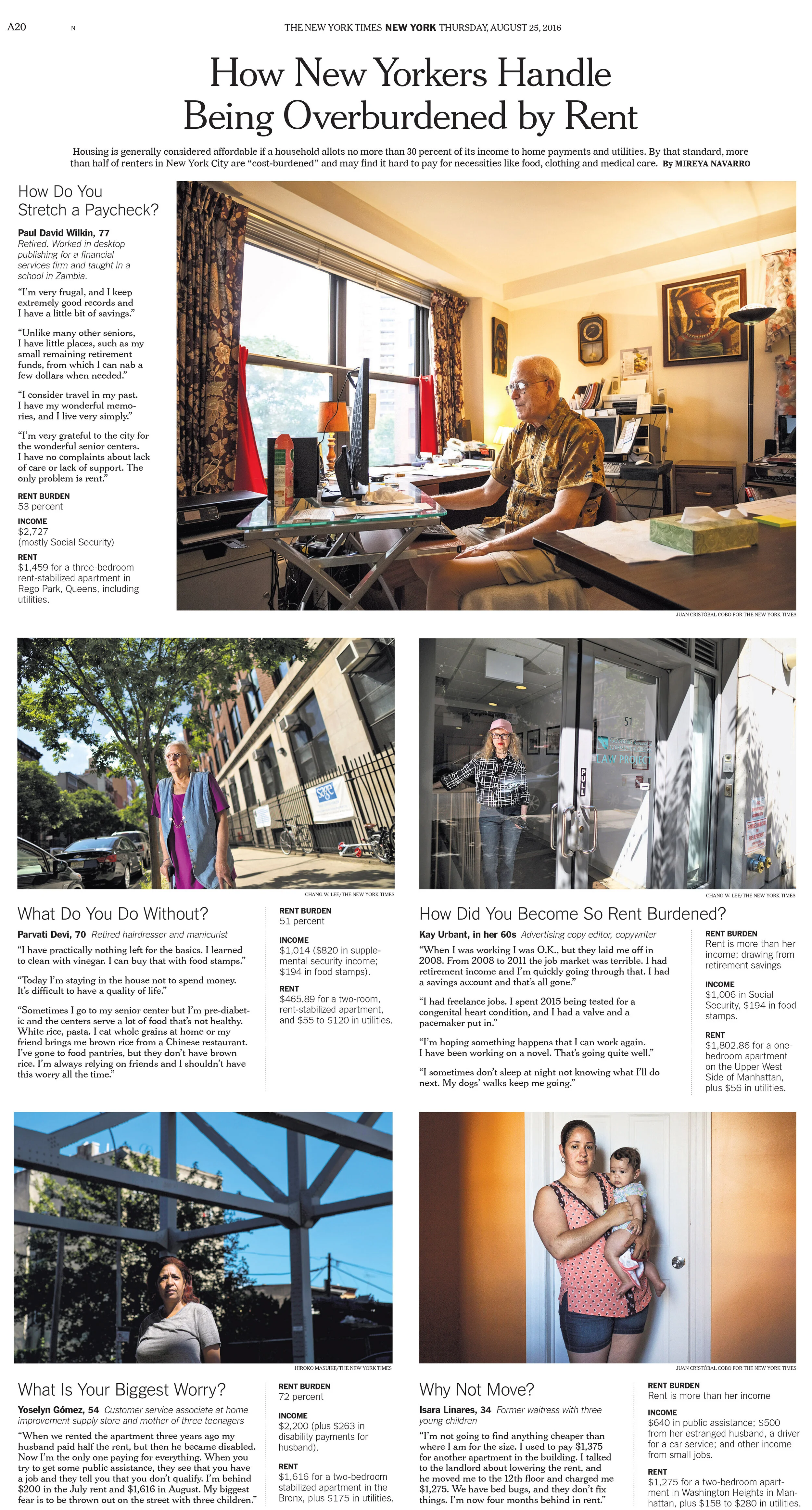
Listicles are so much easier to design in digital. The challenge here was to give each photo its due but manage to contain the content to one page.
I worked with so many fantastic people at New York Times. It was hard to sell editors on a six-column photo of a reflection, but in the end we were able to convince others that this helped tell this very important story.
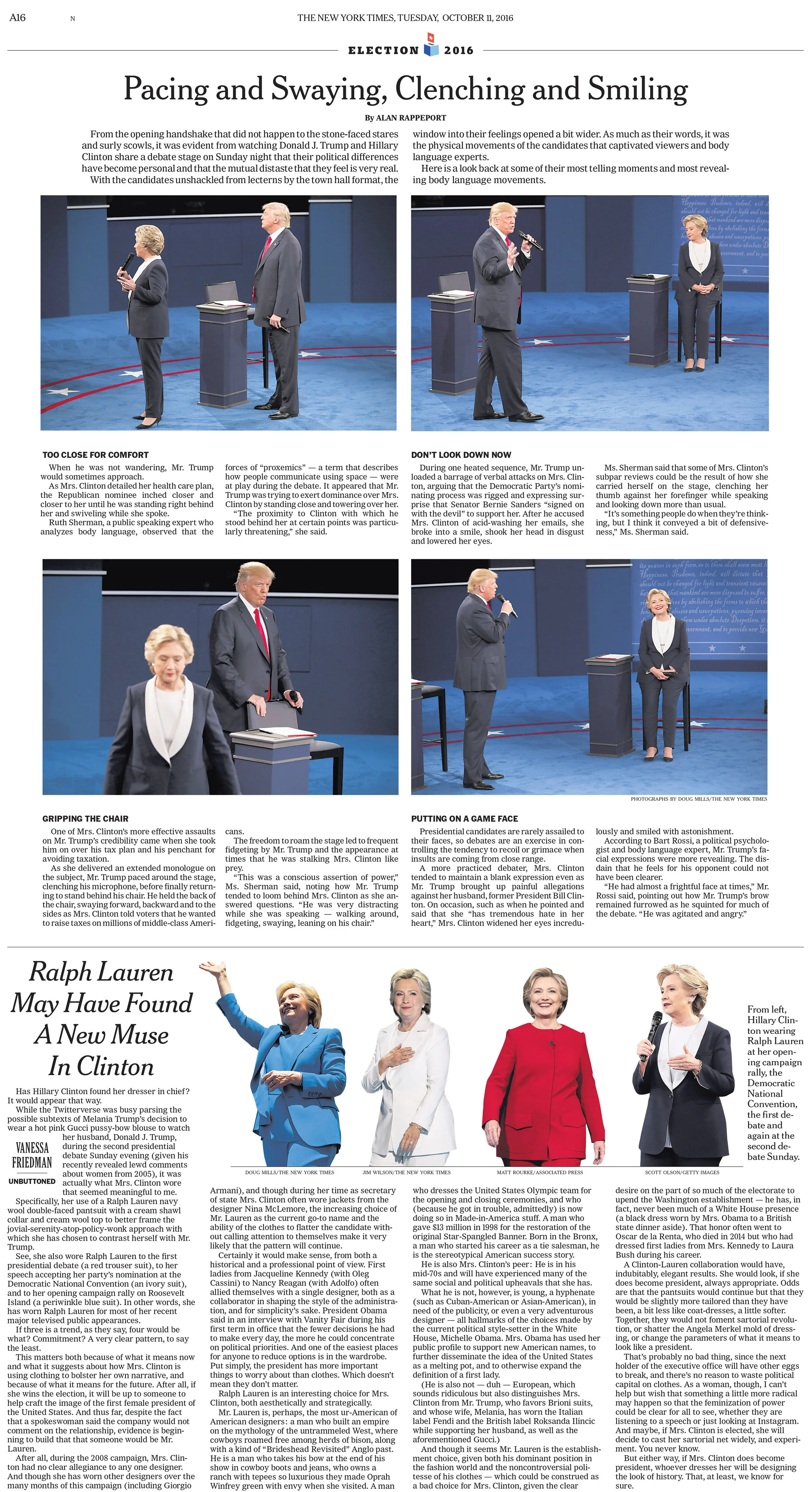
This analysis of one of the 2016 debates really needed photos paired with text to tell the story properly.
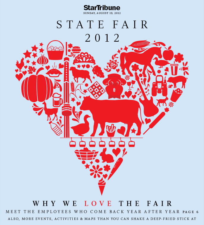
This illustration was a valentine to the Minnesota State Fair. This was made and sold as a poster and tshirt by Star Tribune. It also turned into seed art and won first prize in the 2013 state fair competition. The artist was not affiliated with Star Tribune. The 2013 seed art I commissioned of Grumpy Cat won 3rd place.
I was art director for Vita.mn a now shuttered tabloid from Star Tribune. This had an inside double truck with a flow chart.


